Chapter 5.20 — The `<img>` Element
Complete HTML reference guide for the `<img>` element including attributes, responsive images, accessibility, SEO, performance optimization, browser behavior, and professional implementation."
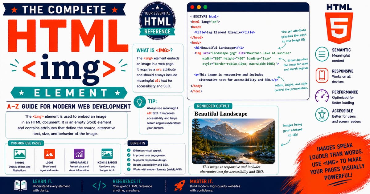
Chapter 5.20 — The <img> Element
The HTML <img> element is one of the most fundamental elements in web development.
It is used to embed images into HTML documents and represents one of the earliest visual features of the web.
From simple blog illustrations to complex web applications, the <img> element remains the primary method for displaying images.
Although the syntax appears simple, modern image handling involves many advanced concepts:
- Responsive images
- Multiple image formats
- Accessibility
- Performance optimization
- Search engine optimization
- Lazy loading
- Security
- Browser rendering behavior
A professional web developer must understand not only how to display an image, but also how browsers load, process, and optimize images.
Quick Facts
| Property | Value |
|---|---|
| Element | <img> |
| HTML Version | HTML 1.0 and later |
| Category | Embedded Content |
| Type | Void Element |
| Closing Tag | Not Required |
| DOM Interface | HTMLImageElement |
| Main Purpose | Displays images |
Basic Syntax
The simplest form of an image element:
1
<img src="photo.jpg" alt="Mountain landscape">
The browser loads the image specified by the src attribute and displays it inside the webpage.
The alt attribute provides a text alternative describing the image.
Why Was <img> Created?
In the early days of the web, HTML documents were mainly text-based.
The <img> element was introduced to allow documents to include visual content.
This changed the web from a collection of text documents into a multimedia platform.
Images became essential for:
- News websites
- Online stores
- Educational platforms
- Personal blogs
- Social networks
HTML Living Standard Definition
According to the HTML Living Standard, the <img> element represents an image resource embedded into the document.
The element creates a replaced element.
A replaced element means:
- The browser displays external content.
- The HTML itself does not define the visual appearance.
- The resource determines the final rendered content.
Examples of replaced elements:
<img><video><iframe><input>
The <img> Element as a Void Element
The <img> element does not contain child content.
Correct:
1
<img src="logo.png" alt="Website logo">
Incorrect:
1
2
3
4
5
<img>

    Image description

</img>
The second example is invalid HTML.
Required Attributes
The <img> element has two important attributes:
src
Specifies the image resource.
Example:
1
<img src="flower.jpg" alt="Red flower">
alt
Provides alternative text.
Example:
1
<img src="flower.jpg" alt="A red flower in a garden">
The alt attribute is essential for accessibility and SEO.
Understanding the src Attribute
The src attribute tells the browser where the image file exists.
Example:
1
<img src="/images/banner.jpg" alt="Banner image">
The value can be:
- Relative URL
- Absolute URL
- Data URL
Relative URL
Most websites use relative paths.
Example:
1
<img src="images/photo.jpg" alt="Photo">
The browser searches relative to the current website location.
Absolute URL
An external image can be loaded using a complete URL.
Example:
1
<img src="https://example.com/photo.jpg" alt="External image">
Use external images carefully because availability depends on another server.
Data URL Images
Small images can be embedded directly.
Example:
1
<img src="data:image/png;base64,iVBORw0KGgo..." alt="Icon">
Advantages:
- No additional HTTP request.
Disadvantages:
- Larger HTML files.
- Harder maintenance.
Usually used only for small icons.
Image Formats
Modern websites use multiple image formats.
| Format | Best Use |
|---|---|
| JPEG | Photographs |
| PNG | Transparency |
| WebP | Modern compressed images |
| AVIF | Maximum compression |
| SVG | Logos and icons |
| GIF | Simple animations |
Choosing the correct format improves performance.
Image Dimensions
The browser benefits when image dimensions are specified.
Example:
1
2
3
4
5
<img
src="mountain.jpg"
alt="Mountain"
width="1200"
height="800">
Benefits:
- Prevents layout shifting.
- Improves page stability.
- Helps browser rendering.
Practical Example: Blog Featured Image
1
2
3
4
5
<img
src="/assets/images/html-guide.jpg"
alt="Complete HTML Reference Guide"
width="1200"
height="630">
This type of image is commonly used for:
- Blog headers
- Social sharing
- Article previews
Pro Tip
Always prepare images before uploading them.
A professional workflow:
- Resize the image.
- Compress the image.
- Convert to modern formats.
- Add meaningful filename.
- Write useful alt text.
- Specify dimensions.
Common Mistakes
Mistake 1: Missing alt
Incorrect:
1
<img src="cat.jpg">
Better:
1
<img src="cat.jpg" alt="Sleeping cat">
Mistake 2: Uploading huge images
A 10 MB image slows down the entire page.
Optimize images before publishing.
Mistake 3: Using meaningless filenames
Poor:
1
IMG_839274.jpg
Better:
1
html-reference-guide.jpg
Mistake 4: Using images instead of text
Important information should not exist only inside images.
Accessibility Note
The <img> element is one of the most important elements for web accessibility.
Screen readers use the alt attribute to describe images.
Good:
1
2
3
<img
src="teacher.jpg"
alt="Teacher explaining HTML concepts to students">
Bad:
1
2
3
<img
src="teacher.jpg"
alt="image">
The description should communicate the purpose of the image.
SEO Note
Images can improve search visibility when optimized correctly.
Best practices:
- Use descriptive filenames.
- Write meaningful alt text.
- Compress images.
- Use appropriate dimensions.
- Add images near relevant content.
- Use structured data when appropriate.
Search engines use image information to understand page content.
Summary
In this section, you learned:
- Purpose of the
<img>element. - HTML Living Standard definition.
- Void element behavior.
srcattribute.altattribute.- Image formats.
- Dimensions.
- Accessibility basics.
- SEO foundations.
Coming Up Next — Section 5.20.2
The next section will cover:
- Complete
<img>attribute reference. - Global attributes.
widthandheight.loading.decoding.fetchpriority.crossorigin.referrerpolicy.- Browser image loading process.
- HTMLImageElement DOM API.
5.20.2 Complete Attribute Reference of the <img> Element
The <img> element contains several attributes that control how images are loaded, displayed, optimized, and interpreted by browsers.
While the basic form of an image only requires src and alt, modern web development uses many additional attributes to improve:
- Performance
- Accessibility
- SEO
- Security
- User experience
A professional developer should understand every important <img> attribute and when to use it.
<img> Element Anatomy
A complete image element may look like this:
1
2
3
4
5
6
7
8
<img
src="/images/html-guide.webp"
alt="Complete HTML Reference Guide"
width="1200"
height="630"
loading="lazy"
decoding="async"
fetchpriority="high">
Each attribute provides information to the browser.
Attribute Overview
| Attribute | Purpose |
|---|---|
src | Specifies image location |
alt | Provides alternative text |
width | Defines image width |
height | Defines image height |
srcset | Provides multiple image versions |
sizes | Defines responsive image display sizes |
loading | Controls lazy loading |
decoding | Controls image decoding behavior |
fetchpriority | Controls loading priority |
crossorigin | Controls cross-origin requests |
referrerpolicy | Controls referrer information |
usemap | Connects image maps |
ismap | Enables server-side image maps |
The src Attribute
The src attribute is the most important attribute of the <img> element.
It specifies the image resource that the browser should download.
Example:
1
2
3
<img
src="mountain.jpg"
alt="Snow covered mountain">
The browser uses the URL provided in src to retrieve the image.
Relative Image Paths
Most websites use relative paths.
Example:
1
2
3
<img
src="/assets/images/logo.png"
alt="Website logo">
The browser searches inside the same website.
Common Jekyll structure:
1
2
3
4
5
assets/

└── images/

    └── logo.png
Absolute Image Paths
An image can also come from another website.
Example:
1
2
3
<img
src="https://example.com/photo.jpg"
alt="External photograph">
However, external images should be used carefully.
Problems include:
- Broken links
- Slow external servers
- Copyright issues
- Dependency on another website
The alt Attribute
The alt attribute provides alternative text.
Example:
1
2
3
<img
src="teacher.jpg"
alt="Teacher explaining HTML concepts">
It is used by:
- Screen readers
- Search engines
- Users when images fail to load
Empty alt Attribute
Decorative images should use an empty alt.
Example:
1
2
3
<img
src="background-pattern.png"
alt="">
This tells assistive technologies to ignore the image.
Writing Effective Alternative Text
Good:
1
2
3
<img
src="elephant.jpg"
alt="African elephant walking through grassland">
Poor:
1
2
3
<img
src="elephant.jpg"
alt="image">
The purpose of alternative text is communication, not keyword stuffing.
The width Attribute
The width attribute specifies the displayed width.
Example:
1
2
3
4
<img
src="photo.jpg"
alt="Nature"
width="800">
Benefits:
- Helps browser layout calculation.
- Reduces layout shifting.
- Improves page stability.
The height Attribute
The height attribute specifies the displayed height.
Example:
1
2
3
4
5
<img
src="photo.jpg"
alt="Nature"
width="800"
height="600">
Using both width and height allows browsers to reserve space before the image loads.
Why Image Dimensions Matter
Without dimensions:
1
2
3
<img
src="large-photo.jpg"
alt="Landscape">
The browser does not immediately know the image size.
This can cause:
- Content movement
- Poor user experience
- Increased CLS score
With dimensions:
1
2
3
4
5
<img
src="large-photo.jpg"
alt="Landscape"
width="1200"
height="800">
The browser can reserve the correct space.
Pro Tip
Always specify image dimensions for important images such as:
- Hero images
- Blog featured images
- Product images
- Advertisements
This improves Core Web Vitals performance.
The loading Attribute
The loading attribute controls when images are loaded.
Available values:
| Value | Meaning |
|---|---|
lazy | Delay loading until needed |
eager | Load immediately |
Lazy Loading Example
1
2
3
4
<img
src="gallery-image.jpg"
alt="Gallery image"
loading="lazy">
The browser delays downloading until the image approaches the viewport.
When Not to Use Lazy Loading
Avoid lazy loading for:
- Main hero images
- Above-the-fold content
- Important first-screen graphics
Example:
1
2
3
4
<img
src="hero.jpg"
alt="Website introduction"
loading="eager">
Performance Note
Correct use of lazy loading can reduce:
- Initial page size
- Network requests
- Mobile data usage
However, incorrect use can delay important content.
The decoding Attribute
The decoding attribute controls how the browser decodes image data.
Values:
| Value | Meaning |
|---|---|
sync | Decode immediately |
async | Decode separately |
auto | Browser decides |
Example:
1
2
3
4
<img
src="article-image.jpg"
alt="Article illustration"
decoding="async">
The fetchpriority Attribute
The fetchpriority attribute tells browsers how important an image is.
Values:
| Value | Meaning |
|---|---|
high | Important resource |
low | Less important |
auto | Browser decision |
Example:
1
2
3
4
<img
src="hero.jpg"
alt="Homepage banner"
fetchpriority="high">
When to Use fetchpriority="high"
Recommended for:
- Main hero images
- Largest Contentful Paint images
- Important above-the-fold images
Do not apply it to every image.
Common Mistake
Incorrect:
1
2
3
<img
src="every-image.jpg"
fetchpriority="high">
Making every image high priority removes the browser’s ability to prioritize correctly.
Accessibility Checklist
For every meaningful image:
- Use descriptive
alt. - Avoid unnecessary decorative descriptions.
- Do not place essential text only inside images.
- Maintain sufficient contrast when text overlays images.
SEO Checklist
For better image search visibility:
- Use meaningful filenames.
- Write useful alt text.
- Compress images.
- Use modern formats.
- Provide dimensions.
- Keep images relevant to the article.
Example filename:
Good:
1
html-img-element-guide.webp
Poor:
1
IMG001928.webp
Summary
In this section, you learned:
- Complete
<img>attribute overview. src.alt.width.height.loading.decoding.fetchpriority.- Accessibility practices.
- SEO optimization.
Coming Up Next — Section 5.20.3
The next section will cover:
- Responsive images using
srcset - The
sizesattribute - Browser image selection algorithm
- Art direction
- Image format strategies
- WebP and AVIF usage
- Responsive design patterns
- Professional Jekyll implementation
5.20.3 Responsive Images, srcset, sizes, Art Direction, Browser Selection Algorithm, and Modern Image Strategies
Modern websites are accessed from thousands of different devices:
- Desktop computers
- Laptops
- Tablets
- Smartphones
- Smart TVs
- High-resolution displays
A single image file cannot provide the best experience for every device.
A large desktop image wastes bandwidth on mobile devices, while a small mobile image looks poor on large screens.
The solution is responsive images.
The <img> element supports responsive image technologies through:
srcsetsizes<picture><source>
These features allow browsers to select the most appropriate image automatically.
What Are Responsive Images?
Responsive images are images that adapt according to:
- Screen size
- Device resolution
- Browser capability
- Network conditions
- Layout requirements
Example:
A desktop user may receive:
1
hero-large.webp
A mobile user may receive:
1
hero-small.webp
The browser makes the decision.
Why Responsive Images Matter
Without responsive images:
A website might send:
1
2 MB desktop image
to a smartphone user who only needs:
1
200 KB mobile image
This causes:
- Slower loading
- Higher mobile data usage
- Poor user experience
- Lower performance scores
The srcset Attribute
The srcset attribute provides multiple image candidates.
Example:
1
2
3
4
5
6
7
<img
src="small.jpg"
alt="Mountain landscape"
srcset="
small.jpg 480w,
medium.jpg 800w,
large.jpg 1200w">
The browser chooses the best image based on available information.
Understanding Width Descriptors
The w value represents image width.
Example:
1
480w
means:
1
This image file is 480 pixels wide.
Example:
1
2
3
4
5
6
7
<img
src="mountain-small.jpg"
alt="Mountain"
srcset="
mountain-small.jpg 480w,
mountain-medium.jpg 800w,
mountain-large.jpg 1200w">
The browser knows the size of each candidate.
Resolution Switching
Responsive images can also use pixel density descriptors.
Example:
1
2
3
4
5
6
<img
src="logo.png"
alt="Company logo"
srcset="
logo.png 1x,
logo@2x.png 2x">
This is useful for:
- Retina displays
- High-density screens
- Mobile devices
The sizes Attribute
The sizes attribute tells the browser how much space the image will occupy.
Example:
1
2
3
4
5
6
7
8
9
10
11
<img
src="image-small.jpg"
alt="Example"
srcset="
image-small.jpg 480w,
image-medium.jpg 800w,
image-large.jpg 1200w"
sizes="
(max-width:600px) 480px,
(max-width:1000px) 800px,
1200px">
The browser uses this information before downloading the image.
How sizes Works
Example:
1
2
3
sizes="
(max-width:600px) 100vw,
50vw"
Meaning:
If the viewport is:
1
600px or smaller
use:
1
100% of viewport width
Otherwise:
1
50% of viewport width
Complete Responsive Image Example
1
2
3
4
5
6
7
8
9
10
11
12
13
<img
src="/images/article-small.jpg"
alt="HTML tutorial illustration"
srcset="
/images/article-small.jpg 480w,
/images/article-medium.jpg 800w,
/images/article-large.jpg 1200w"
sizes="
(max-width:600px) 480px,
(max-width:1000px) 800px,
1200px"
width="1200"
height="630">
This is a production-ready responsive image pattern.
Browser Image Selection Algorithm
When the browser encounters responsive images, it performs several steps.
Step 1
Read the available image candidates.
Example:
1
2
3
small.jpg
medium.jpg
large.jpg
Step 2
Check the display size.
The browser calculates:
- Viewport width
- CSS layout size
- Device pixel ratio
Step 3
Choose the most appropriate resource.
The browser considers:
- Image quality
- File size
- Screen resolution
- Network conditions
Step 4
Download only the selected image.
Other candidates are ignored.
Art Direction
Responsive images are not always about different sizes.
Sometimes the image itself should change.
Example:
Desktop:
1
Wide city skyline
Mobile:
1
Focused building view
This technique is called art direction.
Art Direction Using <picture>
Example:
1
2
3
4
5
6
7
8
9
10
11
12
13
14
15
<picture>

<source
media="(max-width:600px)"
srcset="mobile-city.jpg">

<source
media="(min-width:601px)"
srcset="desktop-city.jpg">

<img
src="desktop-city.jpg"
alt="City skyline">

</picture>
The browser receives different compositions.
Responsive Image Formats
Modern websites commonly provide:
AVIF
Advantages:
- Excellent compression
- Small file size
- High quality
Best for:
- Modern browsers
- Large photographs
WebP
Advantages:
- Good compression
- Wide browser support
Best for:
- General website images
JPEG
Advantages:
- Universal support
- Good photographic quality
Best for:
- Fallback images
Recommended Format Strategy
A professional approach:
1
2
3
4
5
AVIF
↓
WebP
↓
JPEG
Example:
1
2
3
4
5
6
7
8
9
10
11
12
13
14
15
<picture>

<source
srcset="image.avif"
type="image/avif">

<source
srcset="image.webp"
type="image/webp">

<img
src="image.jpg"
alt="Example">

</picture>
Responsive Images in Jekyll
Jekyll websites can easily use responsive images.
Example structure:
1
2
3
4
5
6
7
8
9
assets/

└── images/

    ├── html-small.webp

    ├── html-medium.webp

    └── html-large.webp
Markdown file:
1
2
3
4
5
6
7
8
<img
src="/assets/images/html-small.webp"
alt="HTML Reference Guide"
srcset="
/assets/images/html-small.webp 480w,
/assets/images/html-medium.webp 800w,
/assets/images/html-large.webp 1200w"
sizes="100vw">
Jekyll Pro Tip
For a large documentation website like an HTML reference book:
Create separate folders:
1
2
3
4
assets/images/html/
assets/images/tutorials/
assets/images/posts/
assets/images/posters/
This makes future maintenance easier.
Common Responsive Image Mistakes
Mistake 1
Using srcset without sizes.
The browser may make incorrect assumptions about image display size.
Mistake 2
Creating too many image versions.
Example:
1
20 different sizes
Usually unnecessary.
Mistake 3
Uploading huge original files.
Always optimize before publishing.
Mistake 4
Ignoring mobile users.
Most web traffic now comes from mobile devices.
Accessibility Note
Responsive images must maintain accessibility.
Remember:
- The
<img>element still requiresalt. - Changing images should not change meaning.
- Important information should not disappear on smaller screens.
SEO Note
Responsive images help SEO by improving:
- Page speed
- Mobile experience
- Core Web Vitals
Search engines prefer pages that provide fast and accessible experiences.
Summary
In this section, you learned:
- Responsive image concepts.
- The
srcsetattribute. - Width descriptors.
- Resolution switching.
- The
sizesattribute. - Browser image selection.
- Art direction.
- AVIF and WebP strategies.
- Jekyll responsive image implementation.
Coming Up Next — Section 5.20.4
The next section will cover:
- Browser rendering process of images
HTMLImageElementDOM API- JavaScript image manipulation
- Image loading events
- CSS interaction
- Security considerations
- Performance measurement
- Professional image workflows
- Interview questions
- Complete
<img>element reference summary
5.20.4 Browser Rendering Process, HTMLImageElement DOM API, JavaScript Interaction, CSS Integration, Security, Performance Measurement, and Professional Workflows
In the previous section, you learned how responsive images work using srcset, sizes, art direction, modern formats, and Jekyll implementation techniques.
This section explores what happens after the browser receives an image element.
You will learn:
- How browsers process images.
- How images are represented in the DOM.
- How JavaScript interacts with images.
- How CSS controls image presentation.
- Security considerations.
- Performance measurement.
- Professional image workflows.
Browser Image Rendering Process
When a browser encounters an <img> element, it performs several operations.
Example:
1
2
3
<img
src="mountain.jpg"
alt="Mountain landscape">
The browser follows this process:
1
2
3
4
5
6
7
8
9
10
11
12
13
14
15
16
17
18
19
20
21
22
23
24
25
26
27
28
29
30
31
32
33
HTML Parser

↓

Create Image Element

↓

Read Attributes

↓

Resolve Image URL

↓

Check Cache

↓

Download Image

↓

Decode Image

↓

Create Render Object

↓

Display Image
Step 1 — HTML Parsing
The browser first reads the HTML document.
Example:
1
<img src="photo.jpg" alt="Photo">
The parser creates an image element in the DOM.
Step 2 — Resource Discovery
The browser discovers the image URL:
1
photo.jpg
It determines:
- Location
- File type
- Loading priority
- Whether it exists in cache
Step 3 — Image Download
If the image is not cached, the browser sends a network request.
The request includes:
- URL
- Cookies if allowed
- Security headers
- Referrer information
Step 4 — Image Decoding
After downloading, the browser converts compressed image data into pixels.
Examples:
JPEG:
1
2
3
4
5
Compressed data
↓
Decoded pixels
↓
Displayed image
Step 5 — Rendering
The browser places the image into the layout.
It calculates:
- Width
- Height
- Position
- Relationship with surrounding content
The DOM Representation
Example:
1
2
3
<img
src="logo.png"
alt="Company logo">
DOM tree:
1
2
3
4
5
6
7
Document

└── html

    └── body

        └── img
The browser represents this element using a special interface.
HTMLImageElement Interface
The DOM interface for images is:
1
HTMLImageElement
Inheritance:
1
2
3
4
5
6
7
8
9
10
11
12
13
14
15
16
17
EventTarget

↓

Node

↓

Element

↓

HTMLElement

↓

HTMLImageElement
This interface allows JavaScript to inspect and modify images.
Accessing an Image with JavaScript
HTML:
1
2
3
4
<img
id="logo"
src="logo.png"
alt="Logo">
JavaScript:
1
2
const image =
document.getElementById("logo");
Now the script can control the image.
Reading Image Information
Example:
1
console.log(image.src);
Returns the current image URL.
Getting alternative text:
1
console.log(image.alt);
Getting dimensions:
1
2
console.log(image.width);
console.log(image.height);
Changing Image Source
JavaScript can replace images dynamically.
Example:
1
2
3
4
5
const image =
document.querySelector("img");

image.src =
"new-image.jpg";
The browser downloads the new resource.
Changing Alternative Text
Example:
1
2
image.alt =
"New image description";
This updates accessibility information.
Detecting Image Loading
Images provide loading events.
Example:
1
2
3
4
5
image.onload = function(){

console.log("Image loaded successfully");

};
Detecting Image Errors
Example:
1
2
3
4
5
image.onerror = function(){

console.log("Image failed to load");

};
Useful for:
- Broken image handling
- Fallback systems
- Debugging
Complete Loading Example
1
2
3
4
5
6
7
8
9
10
11
12
13
14
const image =
document.querySelector("img");

image.onload = () => {

console.log("Loaded");

};

image.onerror = () => {

console.log("Failed");

};
Checking Image Completion
The complete property tells whether an image has finished loading.
Example:
1
2
3
4
5
if(image.complete){

console.log("Image ready");

}
CSS Integration
The <img> element behaves like a replaced element.
CSS controls its appearance.
Example:
1
2
3
4
5
6
7
img{

max-width:100%;

height:auto;

}
This makes images responsive.
Object Fit
The object-fit property controls how images fill their containers.
Example:
1
2
3
4
5
6
7
8
9
.card img{

width:300px;

height:200px;

object-fit:cover;

}
Common values:
| Value | Purpose |
|---|---|
| cover | Fill container |
| contain | Show complete image |
| fill | Stretch image |
| none | Original size |
Rounded Images
Example:
1
2
3
4
5
.profile-image{

border-radius:50%;

}
Useful for:
- Profile pictures
- Avatars
Image Filters
CSS can apply visual effects.
Example:
1
2
3
4
5
img{

filter:grayscale(100%);

}
Possible effects:
- Brightness
- Contrast
- Blur
- Saturation
Responsive CSS Pattern
Recommended:
1
2
3
4
5
6
7
8
9
img{

display:block;

max-width:100%;

height:auto;

}
This prevents overflow on smaller screens.
Security Considerations
The <img> element is generally safe, but developers should still follow security practices.
External Images
Loading images from unknown sources may create risks.
Problems include:
- Tracking
- Privacy concerns
- Broken resources
Use trusted sources.
User Uploaded Images
Applications accepting uploads should:
- Validate file types.
- Limit file size.
- Remove dangerous metadata.
- Rename uploaded files.
- Store files securely.
Cross-Origin Images
Images from another domain may require permission.
Example:
1
2
3
<img
src="https://example.com/image.jpg"
crossorigin="anonymous">
The crossorigin attribute controls cross-origin requests.
Performance Measurement
Professional developers measure image performance using:
- Lighthouse
- Chrome DevTools
- PageSpeed Insights
- Web Performance APIs
Lighthouse Checks
Lighthouse evaluates:
- Image optimization
- Proper sizing
- Modern formats
- Lazy loading
- Performance impact
Chrome DevTools Analysis
Open:
1
2
3
4
5
6
7
8
9
Developer Tools

↓

Network Tab

↓

Filter Images
You can inspect:
- File size
- Loading time
- Format
- Request priority
Core Web Vitals
Images strongly affect:
Largest Contentful Paint (LCP)
Large images are often the LCP element.
Optimization techniques:
- Compress images.
- Use correct dimensions.
- Use
fetchpriority.
Cumulative Layout Shift (CLS)
Prevent movement by specifying:
1
2
width="1200"
height="630"
Professional Image Workflow
A professional workflow:
Step 1
Create original image.
Step 2
Resize according to usage.
Example:
1
2
3
4
5
6
7
8
Desktop
1200px

Tablet
800px

Mobile
480px
Step 3
Convert formats.
Generate:
- AVIF
- WebP
- JPEG fallback
Step 4
Optimize compression.
Balance:
- Quality
- File size
Step 5
Implement responsive HTML.
Use:
srcsetsizes<picture>
Step 6
Test performance.
Check:
- Mobile speed
- Accessibility
- Browser compatibility
Pro Tip
Do not optimize images only after publishing.
Image planning should happen during content creation.
For a technical blog like an HTML reference website, consistent image optimization improves the entire site’s quality.
Accessibility Checklist
Before publishing:
- Meaningful
alttext. - Correct image purpose.
- No important information hidden only in images.
- Keyboard-friendly surrounding content.
- Proper contrast when text overlays images.
SEO Checklist
For every important image:
- Use descriptive filename.
- Add useful alt text.
- Compress file size.
- Use modern formats.
- Add dimensions.
- Place near relevant content.
Common Mistakes
Mistake 1
Changing image sources with JavaScript without handling loading states.
Mistake 2
Ignoring broken image handling.
Mistake 3
Using CSS to resize huge original images.
Mistake 4
Forgetting accessibility after dynamic image changes.
Mistake 5
Loading important images with low priority.
Summary
In this section, you learned:
- Browser image rendering process.
- Image downloading and decoding.
HTMLImageElement.- JavaScript image manipulation.
- Image loading events.
- CSS integration.
- Security considerations.
- Performance measurement.
- Professional workflows.
Coming Up Next — Section 5.20.5
The next section will complete the <img> chapter with:
- Advanced real-world examples.
- Jekyll production templates.
- Complete attribute reference table.
- Interview questions.
- Publishing checklist.
- Chapter summary.
- Relationship between
<img>,<picture>, and<source>.
5.20.5 Advanced Real-World Examples, Jekyll Production Templates, Complete Attribute Reference, Interview Questions, Publishing Checklist, and Chapter Summary
In the previous sections, you learned how the <img> element works internally, how browsers render images, how JavaScript interacts with images, and how professional developers optimize image delivery.
This final section completes the <img> element reference by bringing everything together into real-world implementations.
You will learn:
- Production image patterns
- Jekyll implementation
- Blog image templates
- Complete attribute reference
- Interview questions
- Publishing checklist
- Final chapter summary
Real-World Example 1 — Blog Featured Image
A typical technical blog article uses a featured image at the top of the page.
Example:
1
2
3
4
5
6
<img
src="/assets/images/html-reference-guide.webp"
alt="Complete HTML Reference Guide for Modern Web Development"
width="1200"
height="630"
fetchpriority="high">
Why this implementation is good:
- Descriptive filename.
- Useful alternative text.
- Correct dimensions.
- High loading priority for important content.
Real-World Example 2 — Lazy Loaded Article Images
Images inside long articles should usually load lazily.
Example:
1
2
3
4
5
6
<img
src="/assets/images/html-element-example.webp"
alt="HTML element example displayed in browser"
width="900"
height="600"
loading="lazy">
Benefits:
- Faster initial page loading.
- Reduced bandwidth.
- Better mobile experience.
Real-World Example 3 — Responsive Article Image
A professional responsive image implementation:
1
2
3
4
5
6
7
8
9
10
11
12
13
<img
src="/assets/images/html-small.webp"
alt="HTML tutorial illustration"
srcset="
/assets/images/html-small.webp 480w,
/assets/images/html-medium.webp 800w,
/assets/images/html-large.webp 1200w"
sizes="
(max-width:600px) 480px,
(max-width:1000px) 800px,
1200px"
width="1200"
height="630">
The browser chooses the correct file automatically.
Real-World Example 4 — Image with Figure and Caption
When an image requires explanation, combine <img> with <figure>.
1
2
3
4
5
6
7
8
9
10
11
12
13
<figure>

<img
src="/assets/images/browser-rendering.webp"
alt="Browser rendering process diagram"
width="1200"
height="700">

<figcaption>
Browser rendering process explained.
</figcaption>

</figure>
This provides better semantic structure.
Jekyll Image Management
For a growing Jekyll website, organize images carefully.
Recommended structure:
1
2
3
4
5
6
7
8
9
10
11
12
13
14
15
16
17
assets/

└── images/

    ├── html/

    │   ├── img-element.webp

    │   ├── picture-element.webp

    │   └── source-element.webp

    ├── tutorials/

    ├── articles/

    └── posters/
Benefits:
- Easier maintenance.
- Cleaner URLs.
- Faster content management.
Jekyll Markdown Usage
Inside a Markdown post:
1
2
3
4
5
<img
src="/assets/images/html/img-element.webp"
alt="HTML img element reference"
width="1200"
height="630">
Jekyll keeps the HTML unchanged during site generation.
Jekyll Front Matter Example
Example:
1
2
3
4
5
6
7
8
9
10
11
12
13
---
layout: post
title: "The img Element Complete Reference"
description: "Complete guide to HTML images, attributes, responsive images, accessibility, SEO, and performance."
categories:
  - HTML
  - Web Development
tags:
  - html
  - img
  - images
  - accessibility
---
Complete <img> Attribute Reference
| Attribute | Description | Common Usage |
|---|---|---|
src | Image location | Required |
alt | Alternative description | Accessibility |
width | Image width | Layout stability |
height | Image height | Layout stability |
srcset | Multiple image sources | Responsive images |
sizes | Display size hints | Responsive images |
loading | Loading behavior | Performance |
decoding | Image decoding method | Rendering control |
fetchpriority | Resource priority | Performance |
crossorigin | Cross-origin control | External resources |
referrerpolicy | Referrer handling | Privacy |
usemap | Image map reference | Interactive images |
ismap | Server-side image map | Legacy feature |
Global Attributes
The <img> element also supports all global HTML attributes.
Examples:
1
2
3
4
5
<img
src="photo.jpg"
alt="Example"
class="article-image"
id="main-image">
Common global attributes:
classidstyletitlelanghiddendata-*
Image SEO Best Practices
A professional SEO image strategy:
Use meaningful filenames
Good:
1
html5-semantic-elements.webp
Bad:
1
IMG_20260101.webp
Write useful alt text
Good:
1
HTML semantic elements structure example
Bad:
1
html html tutorial best html guide
Avoid keyword stuffing.
Optimize file size
Large images reduce:
- Ranking potential.
- User experience.
- Mobile performance.
Image Accessibility Best Practices
Follow these rules:
Informative images
Provide descriptive alt text.
Example:
1
2
3
<img
src="chart.png"
alt="HTML browser support statistics chart">
Decorative images
Use empty alt.
Example:
1
2
3
<img
src="divider.png"
alt="">
Complex images
Provide additional explanation.
Example:
- Charts
- Diagrams
- Infographics
Use:
- Captions
- Nearby text
- Long descriptions
Common Professional Mistakes
Mistake 1
Using images without dimensions.
Problem:
- Layout shift.
Solution:
Always define width and height.
Mistake 2
Uploading original camera images.
Problem:
- Huge file sizes.
Solution:
Resize and compress.
Mistake 3
Ignoring modern formats.
Problem:
- Larger downloads.
Solution:
Use WebP and AVIF.
Mistake 4
Poor alt text.
Problem:
- Accessibility failure.
Solution:
Describe the purpose.
Mistake 5
Using CSS to hide important images.
Problem:
- Search engines and users may miss information.
Interview Questions
Question 1
Is
<img>a normal container element?Answer:
No. It is a void element and cannot contain child elements.
Question 2
Which DOM interface represents
<img>?Answer:
HTMLImageElementQuestion 3
Why is the
altattribute important?Answer:
It provides alternative information for accessibility tools and improves image understanding.
Question 4
What is the purpose of
srcset?Answer:
It provides multiple image candidates for responsive image selection.
Question 5
What is the difference between
<img>and<picture>?Answer:
<img>displays an image, while<picture>provides multiple image sources and uses<img>as the final fallback.Question 6
Why should width and height be specified?
Answer:
They help browsers reserve space and reduce layout shifts.
Publishing Checklist
Before publishing any article containing images:
Technical
- Image exists.
- Correct path used.
- HTML validated.
- Dimensions specified.
Performance
- Images compressed.
- Modern formats generated.
- Lazy loading applied where suitable.
Accessibility
- Alt text reviewed.
- Decorative images ignored properly.
- Captions added when needed.
SEO
- Filename optimized.
- Image relevant to content.
- Alt text meaningful.
Relationship Between Image Elements
Modern HTML image workflow:
1
2
3
4
5
6
7
8
9
10
11
12
13
<img>

↓

<picture>

↓

<source>

↓

Responsive Images
The <img> element is the foundation.
The <picture> element provides alternative choices.
The <source> element provides those alternatives.
Together they create modern image delivery.
Did You Know?
The <img> element is one of the oldest HTML elements still widely used today.
Although it originated in early web development, it continues to evolve through modern additions such as:
- Responsive images.
- Lazy loading.
- Priority hints.
- Modern formats.
This makes <img> a rare example of an HTML element that has remained simple while adapting to modern web requirements.
Chapter 5.20 Summary — The <img> Element
In this chapter, you learned:
Fundamentals
- Purpose of
<img>. - Void element behavior.
- Image embedding.
Attributes
srcaltwidthheightsrcsetsizesloadingdecodingfetchpriority
Responsive Images
- Responsive image concepts.
- Browser selection.
- Art direction.
- Modern formats.
Browser Technology
- Image loading.
- Decoding.
- Rendering.
- DOM interface.
Development
- CSS integration.
- JavaScript control.
- Jekyll implementation.
Professional Practice
- Accessibility.
- SEO.
- Performance.
- Security.
- Production workflows.
Chapter 5 Progress Update
Completed elements:
<br><hr><wbr><pre><blockquote><ol><ul><li><dl><dt><dd><figure><figcaption><img><picture><source>
Coming Up Next — Chapter 5.21 — The <audio> Element
The next chapter will explore HTML audio.
Topics include:
- HTML Living Standard definition.
- Audio embedding.
<source>integration.- Audio formats.
- Browser audio engine.
- Attributes.
- JavaScript Audio API.
- Accessibility.
- SEO.
- Performance.
- Jekyll implementation.
- Professional audio workflows.
End of Chapter 5.20 — The <img> Element
Status: Complete
Next continuation will start:
Chapter 5.21 — The <audio> Element
with the same Jekyll-ready format.