Chapter 5.19 — The `<source>` Element
Complete guide to the HTML `<source>` element, including responsive images, audio, video, browser resource selection, MIME types, accessibility, SEO, performance, and professional implementation.
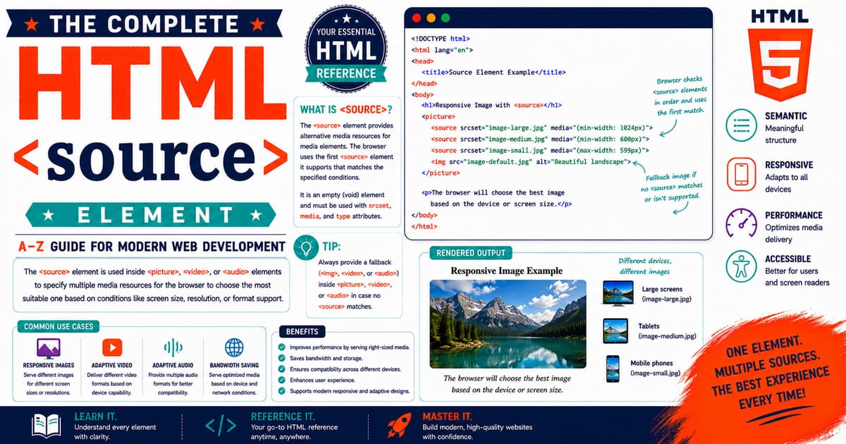
Chapter 5.19 — The <source> Element
The HTML <source> element is one of the most important media elements introduced with HTML5. Unlike elements that display content directly, the <source> element supplies alternative media resources to its parent element.
It enables browsers to choose the most appropriate image, video, or audio resource according to supported file formats, media conditions, screen size, resolution, and other factors.
The <source> element works together with:
<picture><video><audio>
It cannot be used independently.
Quick Facts
| Property | Value |
|---|---|
| Element | <source> |
| HTML Version | HTML5 |
| Closing Tag | Not permitted (Void Element) |
| Parent Elements | <picture>, <audio>, <video> |
| DOM Interface | HTMLSourceElement |
| Primary Purpose | Provides alternative media resources |
| Browser Support | All Modern Browsers |
Why Was <source> Introduced?
Before HTML5, developers had difficulty supporting multiple media formats.
For example:
- Chrome preferred WebM.
- Safari preferred MP4.
- Firefox originally supported Ogg.
Developers often had to rely on plugins or JavaScript.
The <source> element standardized media selection by allowing browsers to evaluate several resources and automatically choose the most suitable one.
When Should You Use This Element?
Use <source> when:
- Multiple image formats are available.
- Multiple video formats are provided.
- Multiple audio formats are provided.
- Responsive images are required.
- Media queries determine which resource should be loaded.
When Should You Avoid This Element?
Do not use <source>:
- Outside
<picture>,<video>, or<audio>. - As a replacement for
<img>. - As a standalone HTML element.
It is always a child element.
Parent Elements
The <source> element is permitted inside only three HTML elements.
| Parent | Purpose |
|---|---|
<picture> | Responsive images |
<video> | Alternative video formats |
<audio> | Alternative audio formats |
No other parent element is valid.
Basic Syntax
Inside a picture:
1
2
3
4
5
6
7
8
9
10
11
<picture>

<source
srcset="forest.avif"
type="image/avif">

<img
src="forest.jpg"
alt="Forest">

</picture>
Inside a video:
1
2
3
4
5
6
7
<video controls>

<source
src="movie.mp4"
type="video/mp4">

</video>
Inside audio:
1
2
3
4
5
6
7
<audio controls>

<source
src="song.mp3"
type="audio/mpeg">

</audio>
Why Multiple Sources Matter
Different browsers support different media formats.
Instead of requiring developers to detect browser capabilities manually, browsers evaluate the available <source> elements automatically.
This improves:
- Compatibility
- Performance
- User experience
- Future maintainability
How Browsers Choose a Source
The browser evaluates each <source> element in order.
It checks:
- Is the media type supported?
- Does the media query match?
- Is the file available?
The first matching source is selected.
If no source matches, the browser falls back to the default media element when available.
Real-World Example
Imagine an online learning platform providing educational videos.
The website supplies:
- MP4
- WebM
Chrome may choose WebM.
Safari may choose MP4.
The developer writes the HTML only once.
The browser performs the selection automatically.
Pro Tip
Always list the preferred format first, followed by compatible fallback formats.
This minimizes unnecessary browser evaluation.
Accessibility Note
The <source> element itself is not announced by assistive technologies.
Accessibility depends on its parent element.
For example:
<img>usesalt<video>uses captions and transcripts<audio>uses transcripts where appropriate
SEO Note
Search engines primarily evaluate the parent media element rather than the
<source>element itself.Optimize:
- filenames
- alternative text
- captions
- nearby headings
- surrounding content
Common Mistakes
Mistake 1
Using <source> without a parent element.
Mistake 2
Providing incorrect MIME types.
Mistake 3
Omitting fallback media.
Mistake 4
Using unsupported image formats without alternatives.
Practical Exercise
Create a file named:
Build a page containing:
- A responsive
<picture>- A
<video>with MP4 and WebM- An
<audio>player with MP3 and Ogg- Appropriate fallback content
Observe which resources your browser selects.
Summary
In this section, you learned:
- Purpose of the
<source>element. - Parent elements.
- Browser source selection.
- Responsive image support.
- Video support.
- Audio support.
- Accessibility.
- SEO.
- Common mistakes.
Coming Up Next — Section 5.19.2
In the next section, you’ll explore the HTML Living Standard definition, content model, browser parsing, the HTMLSourceElement interface, MIME types, media queries, browser selection algorithms, and DOM representation of the <source> element.
5.19.2 HTML Living Standard, Content Categories, Content Model, Browser Parsing, MIME Types, DOM Representation, and Browser Internals
In the previous section, you learned that the <source> element provides alternative media resources for the <picture>, <audio>, and <video> elements. Unlike many HTML elements, <source> never displays content directly. Instead, it helps browsers determine which resource should be loaded based on file format support, media conditions, and other selection criteria.
This section explores how the HTML Living Standard defines the <source> element, how browsers parse it, how MIME types affect resource selection, how the element appears in the Document Object Model (DOM), and how browsers internally process multiple media sources.
HTML Living Standard Definition
The HTML Living Standard defines the <source> element as a void element that specifies multiple media resources for media elements.
It allows browsers to evaluate available resources before downloading them.
Unlike <img>, <video>, or <audio>, the <source> element does not render visible content.
Its responsibility is limited to supplying information about available media resources.
Content Categories
The <source> element belongs to no content category because it is permitted only inside specific parent elements.
| Property | Value |
|---|---|
| Flow Content | No |
| Phrasing Content | No |
| Embedded Content | No |
| Interactive Content | No |
| Metadata Content | No |
Because it has no independent content category, it cannot appear freely within an HTML document.
Permitted Parent Elements
The <source> element is valid only inside:
<picture><audio><video>
Using it elsewhere produces invalid HTML.
Correct example:
1
2
3
4
5
<video controls>

    <source src="movie.mp4" type="video/mp4">

</video>
Incorrect example:
1
2
3
4
5
<div>

    <source src="movie.mp4">

</div>
Void Element
The <source> element is a void element.
This means:
- It has no closing tag.
- It cannot contain child elements.
- It cannot contain text.
Correct:
1
<source src="movie.mp4" type="video/mp4">
Incorrect:
1
2
3
<source src="movie.mp4">

</source>
Required Attributes
Depending on its parent element, <source> commonly uses these attributes.
| Attribute | Purpose |
|---|---|
src | Specifies audio or video resource |
srcset | Specifies responsive image resources |
type | Indicates MIME type |
media | Specifies media query |
Not every attribute is used in every situation.
Using src
When used inside <audio> or <video>, the resource is specified using the src attribute.
Example:
1
2
3
4
5
<video controls>

    <source src="ocean.mp4" type="video/mp4">

</video>
Using srcset
Inside <picture>, the srcset attribute replaces src.
Example:
1
2
3
4
5
6
7
<picture>

    <source srcset="forest.webp" type="image/webp">

    <img src="forest.jpg" alt="Forest">

</picture>
Understanding MIME Types
The type attribute identifies the media format.
Examples:
| MIME Type | Format |
|---|---|
| image/avif | AVIF |
| image/webp | WebP |
| image/jpeg | JPEG |
| video/mp4 | MP4 |
| video/webm | WebM |
| audio/mpeg | MP3 |
| audio/ogg | Ogg |
The browser can often determine whether a format is supported without downloading the resource.
Why MIME Types Matter
Suppose a browser does not support AVIF.
Example:
1
2
3
4
5
6
7
8
9
<picture>

    <source srcset="photo.avif" type="image/avif">

    <source srcset="photo.webp" type="image/webp">

    <img src="photo.jpg" alt="Landscape">

</picture>
The browser skips the unsupported AVIF resource and evaluates the next <source> element.
This reduces unnecessary downloads.
Media Queries
The media attribute allows conditional resource selection.
Example:
1
2
3
4
5
6
7
8
9
10
11
12
13
14
15
16
17
18
19
20
21
<picture>

    <source

        media="(min-width:1200px)"

        srcset="desktop.jpg">

    <source

        media="(min-width:768px)"

        srcset="tablet.jpg">

    <img

        src="mobile.jpg"

        alt="Landscape">

</picture>
Different devices receive different images.
Browser Parsing
When parsing HTML, the browser processes <source> elements sequentially.
Simplified workflow:
1
2
3
4
5
6
7
8
9
10
11
12
13
14
15
16
17
18
19
20
21
22
23
24
25
Read Parent Element

↓

Read First Source

↓

Supported?

↓

Yes → Select Resource

↓

Stop

↓

Otherwise

↓

Read Next Source
The browser stops evaluating once it finds the first suitable resource.
Browser Selection Rules
The browser checks several conditions.
- Is the parent element valid?
- Does the media query match?
- Is the MIME type supported?
- Is the resource available?
- Select the first matching source.
This evaluation occurs automatically.
DOM Representation
Example:
1
2
3
4
5
<video controls>

    <source src="movie.mp4" type="video/mp4">

</video>
DOM Tree:
1
2
3
4
5
6
7
8
9
Document

└── html

    └── body

        └── video

            └── source
The <source> element exists as a child node but does not generate visual output.
HTMLSourceElement Interface
The DOM represents the <source> element using:
1
HTMLSourceElement
Inheritance:
1
2
3
4
5
6
7
8
9
10
11
12
13
14
15
16
17
EventTarget

↓

Node

↓

Element

↓

HTMLElement

↓

HTMLSourceElement
JavaScript can inspect and modify <source> elements through this interface.
Browser Internals
Internally, browsers treat the <source> element as metadata describing available media resources.
The browser evaluates:
- File type
- Media query
- Resource URL
- Parent element
- Device capabilities
Only the selected resource is downloaded whenever possible.
Real-World Example
A streaming platform may provide:
- MP4
- WebM
- AV1
Each browser downloads only the format it supports best.
The user never needs to choose manually.
Pro Tip
Always place your preferred format first.
Example:
- AVIF
- WebP
- JPEG
or
- WebM
- MP4
This allows browsers to stop searching sooner.
Accessibility Note
Accessibility depends entirely on the parent media element.
For example:
- Images require meaningful
alttext. - Videos benefit from captions.
- Audio benefits from transcripts.
The <source> element itself has no accessibility role.
SEO Note
Search engines index the parent media element rather than the
<source>element.Optimizing filenames, captions, surrounding content, and alternative text provides greater SEO benefits than optimizing
<source>itself.
Common Mistakes
Mistake 1
Using <source> outside its permitted parent.
Mistake 2
Using src instead of srcset inside <picture>.
Mistake 3
Providing incorrect MIME types.
Mistake 4
Listing fallback formats before preferred formats.
Practical Exercise
Create a file named:
Build a page containing:
- One
<picture>element.- One
<video>element.- One
<audio>element.- Multiple
<source>elements.- Appropriate MIME types.
Use your browser’s Developer Tools to observe which resources are selected.
Summary
In this section, you learned:
- HTML Living Standard definition.
- Content categories.
- Content model.
- Void element rules.
- Required attributes.
- MIME types.
- Media queries.
- Browser parsing.
- DOM representation.
HTMLSourceElement.- Browser selection algorithm.
Coming Up Next — Section 5.19.3
In the next section, you’ll learn advanced usage of the <source> element with responsive images, videos, audio, CSS integration, JavaScript manipulation, performance optimization, lazy loading strategies, and professional implementation techniques used in modern web applications.
5.19.3 Advanced Usage with <picture>, <video>, and <audio>, CSS Integration, JavaScript, Performance Optimization, and Best Practices
In the previous section, you learned how browsers parse the <source> element, evaluate MIME types, process media queries, and represent the element in the Document Object Model (DOM).
This section focuses on practical development. You’ll learn how professional developers use the <source> element with responsive images, videos, and audio, along with performance optimization techniques, CSS integration, JavaScript interaction, and production-ready best practices.
Using <source> with the <picture> Element
One of the most common uses of <source> is delivering responsive images.
Example:
1
2
3
4
5
6
7
8
9
10
11
12
13
14
15
16
17
<picture>

    <source
        type="image/avif"
        srcset="mountain.avif">

    <source
        type="image/webp"
        srcset="mountain.webp">

    <img
        src="mountain.jpg"
        alt="Mountain Landscape"
        width="1200"
        height="800">

</picture>
The browser selects the first supported image format.
Art Direction
Sometimes different screen sizes require different image compositions.
Desktop:
1
Wide panoramic image
Mobile:
1
Portrait crop
Example:
1
2
3
4
5
6
7
8
9
10
11
12
13
14
15
<picture>

    <source
        media="(min-width:1024px)"
        srcset="hero-desktop.webp">

    <source
        media="(min-width:768px)"
        srcset="hero-tablet.webp">

    <img
        src="hero-mobile.jpg"
        alt="City Skyline">

</picture>
Each device downloads the most suitable image.
Using <source> with <video>
The <source> element allows multiple video formats.
1
2
3
4
5
6
7
8
9
10
11
12
13
<video controls width="640">

    <source
        src="lesson.webm"
        type="video/webm">

    <source
        src="lesson.mp4"
        type="video/mp4">

    Your browser does not support HTML video.

</video>
The browser selects the first compatible format.
Using <source> with <audio>
The same approach applies to audio.
1
2
3
4
5
6
7
8
9
10
11
12
13
<audio controls>

    <source
        src="podcast.ogg"
        type="audio/ogg">

    <source
        src="podcast.mp3"
        type="audio/mpeg">

    Your browser does not support HTML audio.

</audio>
Providing multiple formats increases compatibility.
Combining Media Queries with <source>
The media attribute enables conditional resource loading.
Example:
1
2
3
4
5
6
7
8
9
10
11
12
13
14
15
<picture>

    <source
        media="(orientation: landscape)"
        srcset="landscape.webp">

    <source
        media="(orientation: portrait)"
        srcset="portrait.webp">

    <img
        src="default.jpg"
        alt="Nature">

</picture>
The browser evaluates the current viewport orientation before selecting a resource.
CSS Integration
The <source> element itself is invisible and cannot be styled.
Instead, style the parent media element.
Example:
1
2
3
4
5
6
7
8
9
10
11
12
13
14
15
16
17
18
19
20
21
picture img{

    width:100%;
    height:auto;
    display:block;
    border-radius:10px;

}

video{

    max-width:100%;
    height:auto;

}

audio{

    width:100%;

}
Responsive Containers
1
2
3
4
5
6
7
.media-container{

    max-width:1200px;
    margin:auto;
    padding:1rem;

}
This approach keeps media centered and responsive.
JavaScript Interaction
Selecting all <source> elements:
1
2
const sources =
document.querySelectorAll("source");
Displaying the number of available sources:
1
console.log(sources.length);
Updating a video source dynamically:
1
2
3
4
5
6
7
8
9
const source =
document.querySelector("video source");

source.src="lesson-2.mp4";

const video =
document.querySelector("video");

video.load();
Calling load() tells the browser to reload the updated media.
Updating Responsive Images
Example:
1
2
3
4
5
const image =
document.querySelector("picture img");

image.alt =
"Updated Landscape";
Although <source> elements define available resources, the <img> element continues to provide accessibility information.
Performance Optimization
The <source> element helps reduce unnecessary downloads.
Recommended practices:
- Use AVIF where supported.
- Provide WebP as a secondary option.
- Include JPEG fallback.
- Compress media.
- Resize media appropriately.
- Avoid oversized files.
Optimized resources improve loading speed and reduce bandwidth usage.
Lazy Loading Images
Combine <source> with lazy loading.
1
2
3
4
5
6
7
8
9
10
11
12
13
14
15
16
17
18
19
<picture>

    <source
        srcset="forest.avif"
        type="image/avif">

    <img

        src="forest.jpg"

        alt="Forest"

        loading="lazy"

        width="1200"

        height="800">

</picture>
Images outside the visible viewport load only when needed.
Optimizing Video
Large videos should be compressed before publication.
Recommendations:
- Use H.264 MP4 for compatibility.
- Offer WebM when possible.
- Compress videos without excessive quality loss.
- Stream rather than forcing downloads.
Optimizing Audio
Recommendations:
- Use MP3 for maximum compatibility.
- Offer Ogg where appropriate.
- Keep file sizes reasonable.
- Remove unnecessary silence.
Browser Compatibility Strategy
A common ordering is:
Images:
- AVIF
- WebP
- JPEG
Videos:
- WebM
- MP4
Audio:
- Ogg
- MP3
This order provides efficient formats first while maintaining compatibility.
Real-World Example
An online university publishes lecture videos.
Each lecture provides:
- WebM
- MP4
- Poster image
- Captions
Browsers automatically select the most suitable format.
Students experience faster loading without choosing file types manually.
Pro Tip
Always test responsive media using multiple browsers and device sizes.
Developer Tools in Chrome, Firefox, and Edge allow you to simulate different screen widths and inspect downloaded resources.
Accessibility Note
For images:
- Write descriptive
alttext.
For videos:
- Provide captions.
- Include subtitles when appropriate.
For audio:
- Offer transcripts.
Accessibility should be considered from the beginning of development rather than added later.
SEO Note
Search engines primarily evaluate the parent media element.
To improve visibility:
- Use descriptive filenames.
- Compress media.
- Add captions where appropriate.
- Place media close to relevant headings.
- Avoid duplicate files with different names.
Common Mistakes
Mistake 1
Forgetting to call video.load() after changing video sources with JavaScript.
Mistake 2
Using incorrect MIME types.
Mistake 3
Providing only one media format.
Mistake 4
Using extremely large media files.
Mistake 5
Ignoring responsive image techniques.
Best Practices
Professional developers typically follow this workflow:
- Prepare original media.
- Export optimized formats.
- Compress files.
- Generate modern formats.
- Add fallback resources.
- Specify dimensions.
- Test responsiveness.
- Verify accessibility.
- Measure performance.
- Publish.
Practical Exercise
Create a file named:
Build a webpage containing:
- A responsive
<picture>element with AVIF, WebP, and JPEG.- A
<video>element with WebM and MP4.- An
<audio>element with Ogg and MP3.- Responsive CSS styling.
- JavaScript that changes a video source and reloads it.
Use browser Developer Tools to verify that the correct media resource is selected for each scenario.
Did You Know?
Many modern content delivery networks (CDNs) can automatically generate optimized image formats such as AVIF and WebP from a single uploaded image. Combined with the <source> element, this allows websites to deliver highly optimized media without maintaining separate manual workflows.
Summary
In this section, you learned:
- Advanced use of
<source>with<picture>. - Video and audio source selection.
- Media queries.
- CSS integration.
- JavaScript interaction.
- Performance optimization.
- Lazy loading.
- Browser compatibility strategies.
- Accessibility.
- SEO.
- Professional best practices.
Coming Up Next — Section 5.19.4
In the next section, you’ll explore browser compatibility, accessibility APIs, security considerations, Jekyll integration, production workflows, interview questions, complete technical reference tables, publishing checklists, and the final chapter summary for the <source> element.
5.19.4 Browser Compatibility, Accessibility APIs, Security Considerations, Jekyll Integration, Professional Workflows, and Chapter Summary
In the previous sections, you learned how the <source> element enables browsers to select the most appropriate media resource based on supported file formats, media queries, and device capabilities. You also explored how it works with the <picture>, <video>, and <audio> elements to deliver responsive and optimized media.
This final section completes the <source> element by covering browser compatibility, accessibility APIs, security, Jekyll integration, production workflows, interview questions, and best practices used by professional web developers.
Browser Compatibility
The <source> element has excellent support across all modern browsers.
| Browser | Support |
|---|---|
| Google Chrome | Yes |
| Mozilla Firefox | Yes |
| Microsoft Edge | Yes |
| Apple Safari | Yes |
| Opera | Yes |
| Android Browser | Yes |
| iOS Safari | Yes |
Because support is now universal, <source> can be safely used in production websites.
Browser Support History
Before HTML5, embedding multiple media formats required browser detection scripts or browser-specific plugins.
Common technologies included:
- Adobe Flash
- Microsoft Silverlight
- Java Applets
These solutions required additional software and often introduced compatibility and security issues.
The introduction of HTML5 standardized media delivery through native browser support.
Today, browsers automatically evaluate <source> elements without requiring plugins.
Accessibility APIs
The <source> element itself is not exposed directly to assistive technologies.
Instead, accessibility information comes from the parent element.
Examples:
For images:
alttext from the<img>element
For videos:
- Captions
- Subtitles
- Audio descriptions
For audio:
- Transcripts
- Player controls
This means accessibility depends on how the parent media element is implemented.
Accessibility Best Practices
When using <source>:
- Always provide meaningful alternative text for images.
- Include captions for videos.
- Offer transcripts for audio.
- Ensure media controls are keyboard accessible.
- Avoid autoplay whenever possible.
- Test with screen readers.
Remember that the <source> element helps browsers—not users—choose media resources.
Security Considerations
The <source> element does not introduce unique security risks.
However, media resources should always come from trusted locations.
Recommendations:
- Serve media over HTTPS.
- Restrict uploads to approved file types.
- Validate filenames.
- Use a Content Security Policy (CSP).
- Avoid loading media from untrusted domains.
- Keep media servers updated.
Following these practices reduces the risk of malicious content.
Performance Analysis
Proper use of the <source> element can significantly improve website performance.
Benefits include:
- Smaller downloads.
- Reduced bandwidth usage.
- Faster page rendering.
- Better mobile performance.
- Improved Core Web Vitals.
The browser downloads only the most suitable resource instead of downloading every available file.
Core Web Vitals
The <source> element can positively influence several performance metrics.
| Metric | Improvement |
|---|---|
| Largest Contentful Paint (LCP) | Faster loading through optimized resources |
| Cumulative Layout Shift (CLS) | Improved when media dimensions are specified |
| Interaction to Next Paint (INP) | Reduced network overhead contributes indirectly |
Although <source> itself does not change layout, it helps browsers choose lighter media files that load more efficiently.
Jekyll Integration
The <source> element works perfectly in Jekyll because HTML is preserved inside Markdown files.
Example project structure:
1
2
3
4
5
6
7
8
9
10
11
12
13
14
15
16
17
18
19
20
21
assets/

├── images/

│   ├── banner.avif

│   ├── banner.webp

│   └── banner.jpg

├── videos/

│   ├── tutorial.webm

│   └── tutorial.mp4

└── audio/

    ├── lesson.ogg

    └── lesson.mp3
Example responsive image:
1
2
3
4
5
6
7
8
9
10
11
12
13
14
15
16
17
18
<picture>

    <source
        srcset="/assets/images/banner.avif"
        type="image/avif">

    <source
        srcset="/assets/images/banner.webp"
        type="image/webp">

    <img
        src="/assets/images/banner.jpg"
        alt="Mountain Landscape"
        width="1200"
        height="630"
        loading="lazy">

</picture>
Using consistent directories makes media easier to maintain as the project grows.
Professional Publishing Workflow
A typical publishing workflow is:
- Create the original media.
- Resize it for different devices.
- Compress the files.
- Generate modern formats (AVIF, WebP, WebM).
- Create fallback formats.
- Add appropriate
<source>elements. - Validate HTML.
- Test across multiple browsers.
- Measure performance.
- Publish.
This workflow balances compatibility, quality, and performance.
Pro Tip
Keep the number of alternative resources reasonable.
For example, three image formats (AVIF, WebP, JPEG) are usually sufficient for most websites.
Providing too many variations increases maintenance without delivering significant benefits.
SEO Note
The
<source>element indirectly supports search engine optimization through improved performance.To maximize SEO:
- Optimize media file sizes.
- Use descriptive filenames.
- Include meaningful captions.
- Place media near relevant content.
- Provide accurate
alttext for images.- Avoid duplicate media files.
Search engines reward fast, accessible, and well-structured pages.
Common Mistakes
Mistake 1
Providing only modern formats without fallback resources.
Mistake 2
Using incorrect MIME types.
Mistake 3
Ignoring accessibility requirements.
Mistake 4
Serving unnecessarily large media files.
Mistake 5
Loading media from unreliable third-party servers.
Interview Questions
Question 1
What is the purpose of the
<source>element?Answer:
It provides alternative media resources for
<picture>,<video>, and<audio>elements, allowing the browser to select the most appropriate resource.Question 2
Can the
<source>element exist independently?Answer:
No. It must always be a child of
<picture>,<video>, or<audio>.Question 3
Which DOM interface represents the
<source>element?Answer:
HTMLSourceElementQuestion 4
Which attribute is commonly used with
<picture>instead ofsrc?Answer:
srcsetQuestion 5
Why are MIME types important?
Answer:
They allow browsers to determine whether a media format is supported before downloading the resource.
Practical Exercise
Create a file named:
Build a webpage that includes:
- A responsive image using
<picture>.- A video with WebM and MP4 sources.
- An audio player with Ogg and MP3 sources.
- Responsive CSS.
- Meaningful accessibility features.
- Optimized media files.
Test the page using Chrome, Firefox, Safari, and Edge to compare media selection behavior.
Complete Technical Reference
| Property | Value |
|---|---|
| Element | <source> |
| HTML Version | HTML5 |
| Type | Void Element |
| Closing Tag | Not Permitted |
| Parent Elements | <picture>, <video>, <audio> |
| DOM Interface | HTMLSourceElement |
| Primary Purpose | Specifies alternative media resources |
Did You Know?
Many large media platforms—including streaming services, educational websites, and online news organizations—use the <source> element to deliver different media formats automatically. This allows browsers to choose the most efficient resource without requiring user interaction.
Chapter Summary
Throughout this chapter, you learned:
Fundamentals
- Purpose of the
<source>element. - Valid parent elements.
- Void element rules.
Browser Internals
- HTML Living Standard definition.
- Content model.
- MIME types.
- Browser parsing.
- Source selection algorithm.
- DOM representation.
HTMLSourceElement.
Practical Development
- Responsive images.
- Video sources.
- Audio sources.
- CSS integration.
- JavaScript interaction.
- Media queries.
Performance
- Optimized media delivery.
- Reduced bandwidth usage.
- Responsive image techniques.
- Core Web Vitals considerations.
Professional Publishing
- Accessibility.
- SEO.
- Security.
- Jekyll integration.
- Production workflows.
- Interview preparation.
Chapter 5 Progress Update
Completed elements:
<br><hr><wbr><pre><blockquote><ol><ul><li><dl><dt><dd><figure><figcaption><picture><source>
Coming Up Next — Chapter 5.20 — The <img> Element
The next chapter covers one of the most important elements in HTML.
Topics include:
- HTML Living Standard definition.
- Image formats.
- Required and optional attributes.
src,alt,width,height.srcsetandsizes.- Lazy loading.
- Decoding strategies.
- Fetch priority.
- Accessibility.
- SEO.
- Performance optimization.
- Browser internals.
- JavaScript APIs.
- Jekyll image management.
- Professional production workflows.
The <img> chapter will be one of the longest and most comprehensive chapters in this book.
End of Chapter 5.19 — The <source> Element
Status: Complete.