Chapter 5.18 — The `<picture>` Element
Complete guide to the HTML `<picture>` element, including responsive images, art direction, browser source selection, accessibility, SEO, performance optimization, and professional implementation.
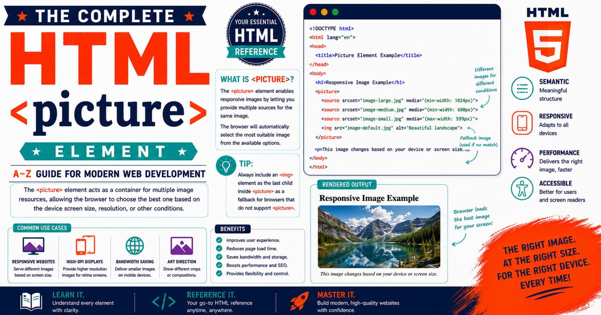
Chapter 5.18 — The <picture> Element
Modern websites are expected to display high-quality images while remaining fast on every device. A single image that looks perfect on a large desktop monitor may be unnecessarily large for a mobile phone, while an image designed for a small screen may appear blurry on high-resolution displays.
The HTML <picture> element was introduced to solve these challenges.
Unlike the <img> element, which displays only one image resource, the <picture> element allows developers to provide multiple image sources. The browser automatically selects the most appropriate image according to factors such as screen size, supported image formats, display resolution, and media queries.
This approach enables responsive images, better performance, reduced bandwidth consumption, and improved visual quality.
Today, the <picture> element is widely used in:
- News websites
- E-commerce platforms
- Photography portfolios
- Educational websites
- Documentation systems
- Corporate websites
- Blogs
- Government portals
- Progressive Web Applications (PWAs)
Quick Facts
| Property | Value |
|---|---|
| Element | <picture> |
| Introduced | HTML5 |
| Category | Flow Content |
| Closing Tag | Required |
| Typical Children | <source>, <img> |
| DOM Interface | HTMLPictureElement |
| Primary Purpose | Responsive image delivery |
| Browser Support | All Modern Browsers |
When Should You Use This Element?
Use the <picture> element when:
- Different images should appear on different screen sizes.
- Modern image formats such as WebP or AVIF should be preferred.
- Art direction requires different image crops for mobile and desktop.
- Image performance is important.
- You want browsers to select the best available resource automatically.
Typical examples include:
- Responsive hero banners
- Product photography
- News article images
- Blog featured images
- Maps
- Infographics
- Marketing banners
When Should You Avoid This Element?
Do not use <picture> when:
- Only one image is required.
- There are no alternative image formats.
- Responsive behavior is unnecessary.
- A standard
<img>element fully satisfies the requirement.
Adding <picture> unnecessarily increases markup complexity.
Why This Element Matters
Imagine a homepage containing a 4000-pixel-wide hero image.
Desktop users benefit from the high-resolution version, but mobile users would download a much larger file than necessary.
With <picture>, browsers can download a smaller image for phones while using the larger image only on wide displays.
Benefits include:
- Faster page loading
- Lower bandwidth usage
- Better Core Web Vitals
- Improved user experience
- Reduced server load
Historical Note
Before the introduction of <picture>, developers relied primarily on CSS techniques or JavaScript libraries to swap images for different screen sizes.
These approaches often downloaded unnecessary files or depended on client-side scripting.
The HTML5 specification introduced <picture> as a native solution, allowing browsers to make intelligent image-selection decisions before downloading image resources.
Relationship with Other Elements
The <picture> element always works together with other HTML elements.
1
2
3
4
5
6
7
8
<picture>

├── <source>

├── <source>

└── <img>
Each element has a specific responsibility:
<picture>groups image sources.<source>defines alternative image resources.<img>provides the fallback image.
Basic Syntax
1
2
3
4
5
6
7
8
9
10
11
<picture>

<source
srcset="mountain.webp"
type="image/webp">

<img
src="mountain.jpg"
alt="Mountain Landscape">

</picture>
If the browser supports WebP, it displays the WebP image.
Otherwise, it falls back to the JPEG image.
How Browsers Process <picture>
Simplified browser workflow:
1
2
3
4
5
6
7
8
9
10
11
12
13
14
15
16
17
18
19
20
21
22
23
24
25
26
27
28
29
Read <picture>

↓

Read first <source>

↓

Supported?

↓

Yes → Load Image

↓

No

↓

Check Next Source

↓

No Matching Source

↓

Load <img>
The browser always evaluates the <source> elements before using the fallback <img> element.
First Practical Example
Responsive image using media queries:
1
2
3
4
5
6
7
8
9
10
11
12
13
14
15
16
17
18
19
20
21
<picture>

<source

media="(min-width:1024px)"

srcset="banner-desktop.webp">

<source

media="(min-width:768px)"

srcset="banner-tablet.webp">

<img

src="banner-mobile.jpg"

alt="Mountain Landscape">

</picture>
Desktop, tablet, and mobile users receive different image files.
Why the <img> Element Is Mandatory
Every <picture> element must contain an <img> element.
The <img> serves as:
- A fallback image.
- The source of the
altattribute. - The image displayed if no
<source>matches.
Without <img>, the markup is invalid.
Real-World Example
An online store may use:
- Large product images for desktops.
- Medium images for tablets.
- Smaller images for smartphones.
Instead of downloading one oversized image for everyone, browsers download only the most appropriate version.
This significantly improves performance on slower networks.
Pro Tip
Think of the <picture> element as a decision-maker rather than an image.
The browser evaluates the available sources and selects the most appropriate one automatically.
Developers provide the available choices—the browser decides which resource should be downloaded.
Accessibility Note
Accessibility continues to rely on the <img> element.
Always provide:
- Meaningful
alttext. - Appropriate image dimensions where possible.
- Images that remain understandable on small screens.
The <picture> element itself does not replace accessibility requirements.
SEO Note
Search engines index the image selected by the browser.
For best results:
- Write descriptive
alttext. - Use meaningful filenames.
- Optimize image sizes.
- Place images near relevant content.
- Compress media before publishing.
Responsive images improve page performance, which indirectly benefits search engine optimization.
Common Mistakes
Mistake 1
Omitting the <img> fallback.
Mistake 2
Providing image formats unsupported by the target audience without a fallback.
Mistake 3
Using <picture> when a single <img> would be sufficient.
Mistake 4
Forgetting to provide meaningful alternative text.
Practical Exercise
Create a file named:
1
picture-introduction.html
Build a page containing:
- One desktop image.
- One tablet image.
- One mobile image.
- A JPEG fallback.
- Appropriate
alttext.
Resize the browser window and observe how different image resources are selected.
Summary
In this section, you learned:
- Why the
<picture>element exists. - When it should be used.
- When it should be avoided.
- How browsers process image sources.
- The relationship between
<picture>,<source>, and<img>. - Basic responsive image techniques.
- Accessibility considerations.
- SEO recommendations.
- Common implementation mistakes.
Coming Up Next — Section 5.18.2
In the next section, you’ll explore the HTML Living Standard definition, content categories, content model, browser parsing, DOM representation, browser source-selection algorithm, and the HTMLPictureElement interface in detail.
5.18.2 HTML Living Standard, Content Categories, Content Model, Browser Parsing, Source Selection Algorithm, DOM Representation, and Browser Internals
In the previous section, you learned that the <picture> element enables responsive image delivery by allowing browsers to choose the most appropriate image resource based on screen size, image format support, display resolution, and media conditions.
In this section, we’ll examine how the HTML Living Standard defines the <picture> element, how browsers parse it, how the source selection algorithm works, how it appears in the Document Object Model (DOM), and how modern browsers determine which image should ultimately be displayed.
Understanding these internal mechanisms helps developers create efficient, maintainable, and high-performance websites.
Why This Matters in Real Projects
Every modern browser attempts to minimize bandwidth usage while displaying the highest-quality image possible.
Consider a news website visited by:
- Desktop users
- Tablet users
- Smartphone users
- High-DPI (“Retina”) displays
- Browsers supporting AVIF
- Browsers supporting WebP
- Older browsers supporting only JPEG
Without <picture>, every visitor might download the same image.
With <picture>, each browser downloads only the image best suited to its capabilities.
5.18.2.1 HTML Living Standard Definition
According to the HTML Living Standard, the <picture> element is a container that enables authors to specify multiple image resources for a single image.
The browser evaluates each <source> element and selects the most appropriate image before rendering.
Unlike <img>, the <picture> element itself does not display an image.
The displayed image always comes from the child <img> element after the browser has completed source selection.
Content Categories
The <picture> element belongs to:
| Content Category | Included |
|---|---|
| Flow Content | Yes |
| Phrasing Content | Yes |
| Embedded Content | No |
| Interactive Content | No |
Because it is Flow Content, <picture> can be placed almost anywhere normal content is allowed.
Permitted Content
A <picture> element may contain:
- Zero or more
<source>elements. - Exactly one
<img>element. - Optional whitespace.
Correct:
1
2
3
4
5
6
7
8
9
10
11
12
13
14
15
<picture>

<source
srcset="photo.avif"
type="image/avif">

<source
srcset="photo.webp"
type="image/webp">

<img
src="photo.jpg"
alt="Landscape">

</picture>
Incorrect:
1
2
3
4
5
<picture>

<p>Example</p>

</picture>
Only <source> elements followed by one <img> element are permitted.
Why the <img> Element Is Required
The <img> element serves several purposes:
- Provides fallback support.
- Contains the
altattribute. - Displays the final image.
- Ensures compatibility with older browsers.
Without <img>, the document is invalid and no fallback image exists.
Browser Parsing
Example:
1
2
3
4
5
6
7
8
9
10
11
12
13
14
15
<picture>

<source
srcset="forest.avif"
type="image/avif">

<source
srcset="forest.webp"
type="image/webp">

<img
src="forest.jpg"
alt="Forest">

</picture>
Simplified parsing sequence:
1
2
3
4
5
6
7
8
9
10
11
12
13
14
15
16
17
18
19
20
21
22
23
24
25
26
Read <picture>

↓

Read first <source>

↓

Supported?

↓

Yes

↓

Use Source

↓

Ignore Remaining Sources

↓

Display <img>
If the browser cannot use the first <source>, it evaluates the next one.
Browser Source Selection Algorithm
The browser evaluates each <source> using several conditions:
- Does the browser support the specified image format?
- Does the
mediaquery match? - Does the
sizesattribute match? - Which candidate in
srcsetis most appropriate? - If no source matches, use the
<img>element.
Simplified decision tree:
1
2
3
4
5
6
7
8
9
10
11
12
13
14
15
16
17
18
19
20
21
22
23
24
25
26
27
28
29
30
31
32
33
34
35
36
37
38
39
40
41
Start

↓

First Source

↓

Format Supported?

↓

No

↓

Next Source

↓

Media Matches?

↓

No

↓

Next Source

↓

Yes

↓

Download Image

↓

Render
This evaluation occurs before downloading the image whenever possible.
DOM Representation
Example HTML:
1
2
3
4
5
6
7
8
9
10
11
<picture>

<source
srcset="river.webp"
type="image/webp">

<img
src="river.jpg"
alt="River">

</picture>
DOM Tree:
1
2
3
4
5
6
7
8
9
10
11
Document

└── html

    └── body

        └── picture

            ├── source

            └── img
The <picture> element acts as the parent node for the image resources.
DOM Interface
Unlike <figure> and <figcaption>, the <picture> element has its own dedicated interface:
1
HTMLPictureElement
Inheritance hierarchy:
1
2
3
4
5
6
7
8
9
10
11
12
13
14
15
16
17
EventTarget

↓

Node

↓

Element

↓

HTMLElement

↓

HTMLPictureElement
This specialized interface represents the <picture> element in the DOM.
Relationship Between <picture>, <source>, and <img>
Visual hierarchy:
1
2
3
4
5
6
7
8
9
Picture

├── Source

├── Source

├── Source

└── Image
Each <source> provides an alternative resource, while the <img> element always remains the final rendering target.
Browser Rendering Process
The rendering process typically follows these steps:
- Parse the HTML.
- Identify the
<picture>element. - Evaluate each
<source>. - Check media conditions.
- Verify image format support.
- Select the best candidate.
- Render the selected image through the
<img>element.
This process is optimized to minimize unnecessary network requests.
Real-World Example — News Website
A newspaper homepage may provide:
- AVIF for modern browsers.
- WebP for compatible browsers.
- JPEG for legacy browsers.
Each visitor automatically receives the best available version.
No JavaScript is required.
Historical Note
Before native responsive image support, developers frequently relied on JavaScript libraries or CSS background images to deliver different image versions.
These approaches often downloaded unnecessary assets.
The <picture> element standardized responsive image selection within HTML itself, allowing browsers to make efficient decisions before initiating downloads.
Pro Tip
Arrange <source> elements from the most specific or most desirable option to the least specific.
For example:
- AVIF
- WebP
- JPEG fallback
This ordering allows browsers to select the most efficient supported format quickly.
Accessibility Note
Accessibility continues to depend on the <img> element.
Always provide:
- Meaningful
alttext. - Appropriate intrinsic image dimensions when possible.
- Images that remain understandable across devices.
The <picture> element enhances delivery but does not replace accessibility practices.
SEO Note
Search engines understand responsive images.
To maximize SEO:
- Use descriptive filenames.
- Optimize image formats.
- Keep image sizes appropriate.
- Place images near related headings and content.
- Ensure the fallback
<img>contains meaningfulalttext.
Faster image delivery can contribute to improved user experience metrics.
Common Mistakes
Mistake 1
Placing the <img> element before <source> elements.
The <img> element must always appear last.
Mistake 2
Providing unsupported image formats without a fallback.
Always include a compatible fallback image.
Mistake 3
Using <picture> for decorative CSS background images.
Use CSS background images when the image is purely decorative.
Mistake 4
Ignoring media queries.
Without appropriate media conditions, responsive image selection may not behave as intended.
Practical Exercise
Create a file named:
1
picture-browser-selection.html
Build a page containing:
- One AVIF source.
- One WebP source.
- One JPEG fallback.
- Media queries for desktop and mobile.
- Meaningful alternative text.
Use browser Developer Tools to inspect which image resource is downloaded under different viewport sizes.
Did You Know?
Modern browsers evaluate <picture> sources before downloading image files whenever possible. This optimization helps avoid unnecessary network requests, improving loading performance and reducing bandwidth consumption on slower connections.
Summary
In this section, you learned:
- The HTML Living Standard definition.
- Content categories.
- Content model.
- Browser parsing.
- Source selection algorithm.
- DOM representation.
HTMLPictureElement.- Browser rendering process.
- Accessibility considerations.
- SEO recommendations.
- Common implementation mistakes.
Coming Up Next — Section 5.18.3
In the next section, you’ll learn advanced CSS techniques, responsive layouts, srcset, the sizes attribute, art direction, modern image formats (AVIF and WebP), lazy loading, JavaScript interaction, and professional optimization strategies used by high-performance websites.
5.18.3 CSS Styling, Responsive Images, srcset, sizes, Art Direction, Modern Image Formats, Lazy Loading, JavaScript, and Professional Optimization
In the previous section, you learned how browsers parse the <picture> element, evaluate multiple <source> elements, and select the most appropriate image resource. Understanding this browser behavior is essential for building responsive websites, but it is only part of the picture.
Professional web developers also optimize images for performance, responsive layouts, accessibility, and maintainability. A correctly implemented <picture> element can significantly improve loading speed, reduce bandwidth usage, and provide a better experience across a wide range of devices.
This section focuses on practical implementation techniques used in modern production websites.
Why This Matters in Real Projects
Images usually account for the largest portion of a webpage’s download size.
Poorly optimized images can lead to:
- Slow page loading.
- Higher mobile data usage.
- Poor Core Web Vitals scores.
- Increased server bandwidth.
- Lower user satisfaction.
Using the <picture> element effectively helps address these challenges.
5.18.3.1 Responsive Images
One of the primary purposes of the <picture> element is responsive image delivery.
Example:
1
2
3
4
5
6
7
8
9
10
11
12
13
14
15
16
17
18
19
20
21
<picture>

<source

media="(min-width:1200px)"

srcset="banner-large.webp">

<source

media="(min-width:768px)"

srcset="banner-medium.webp">

<img

src="banner-small.jpg"

alt="Mountain Landscape">

</picture>
Each device downloads an image appropriate for its screen size.
Understanding srcset
The srcset attribute provides multiple image candidates.
Example:
1
2
3
4
5
6
7
8
9
10
11
12
13
<img

src="photo.jpg"

srcset="

photo-400.jpg 400w,

photo-800.jpg 800w,

photo-1200.jpg 1200w"

alt="Forest">
The browser evaluates the available candidates and selects the most appropriate image.
Understanding the sizes Attribute
The sizes attribute informs the browser about the expected display width of the image.
Example:
1
2
3
4
5
6
7
8
9
10
11
12
13
14
15
16
17
18
19
<img

src="photo.jpg"

srcset="

photo-400.jpg 400w,

photo-800.jpg 800w,

photo-1200.jpg 1200w"

sizes="

(max-width:768px) 100vw,

50vw"

alt="Forest">
The browser combines information from srcset and sizes to download the optimal image.
Art Direction
Sometimes different screen sizes require different image compositions.
Desktop:
1
Wide Landscape
Mobile:
1
Portrait Crop
Example:
1
2
3
4
5
6
7
8
9
10
11
12
13
14
15
<picture>

<source

media="(min-width:992px)"

srcset="landscape.webp">

<img

src="portrait.jpg"

alt="Mountain">

</picture>
This technique is known as art direction.
Unlike ordinary responsive images, different image compositions—not merely different sizes—are delivered.
Modern Image Formats
Modern browsers support highly efficient image formats.
| Format | Advantages |
|---|---|
| AVIF | Excellent compression and quality |
| WebP | Smaller files than JPEG and PNG |
| JPEG | Universal compatibility |
| PNG | Lossless transparency |
| SVG | Vector graphics |
Professional websites commonly provide multiple formats.
Preferred Source Order
A recommended order is:
1
2
3
4
5
6
7
8
9
10
11
<picture>

<source
type="image/avif">

<source
type="image/webp">

<img>

</picture>
This allows browsers to select the most efficient supported format.
Lazy Loading
Large pages containing many images benefit from lazy loading.
Example:
1
2
3
4
5
6
7
<img

loading="lazy"

src="forest.jpg"

alt="Forest">
Images load only when they approach the visible portion of the page.
Benefits include:
- Faster initial rendering.
- Reduced bandwidth usage.
- Better Core Web Vitals.
- Improved mobile performance.
Image Dimensions
Specify image dimensions whenever possible.
Example:
1
2
3
4
5
6
7
8
9
<img

src="building.jpg"

alt="Office Building"

width="1200"

height="800">
Benefits:
- Reduced layout shift.
- Improved visual stability.
- Better user experience.
CSS Styling
Basic example:
1
2
3
4
5
6
7
8
9
10
11
12
13
14
15
16
17
picture{

display:block;

margin:2rem auto;

}

picture img{

display:block;

width:100%;

height:auto;

}
Images automatically scale with the available space.
Rounded Images
Example:
1
2
3
4
5
picture img{

border-radius:12px;

}
Rounded corners are frequently used in blogs and portfolios.
Shadows
1
2
3
4
5
6
7
picture img{

box-shadow:

0 10px 25px rgba(0,0,0,.15);

}
Subtle shadows help separate images from surrounding content.
Responsive Containers
1
2
3
4
5
6
7
.picture-container{

max-width:1200px;

margin:auto;

}
Responsive containers prevent oversized images on large displays.
JavaScript Interaction
Selecting the picture element:
1
2
const picture =
document.querySelector("picture");
Selecting the fallback image:
1
2
const image =
picture.querySelector("img");
Updating the image:
1
image.src="new-photo.jpg";
JavaScript normally modifies the <img> element rather than the <picture> container.
Real-World Example — E-commerce
An online store might provide:
- AVIF images for modern browsers.
- WebP images for compatible browsers.
- JPEG images for legacy browsers.
- Small product images for phones.
- High-resolution images for desktop zoom features.
Customers receive an optimized shopping experience regardless of device.
Historical Note
Responsive images were one of the most requested features during the early growth of mobile web browsing.
The introduction of <picture>, srcset, and sizes transformed image delivery from a JavaScript-based solution into a native browser capability.
Pro Tip
Do not create dozens of image sizes.
Most websites achieve excellent performance with three or four carefully chosen image widths.
For example:
- 480px
- 768px
- 1200px
- 1600px
This keeps image management simple while covering the majority of devices.
Accessibility Note
The <picture> element does not change accessibility requirements.
Always:
- Write meaningful
alttext. - Avoid embedding important text inside images.
- Ensure images remain understandable when resized.
- Use sufficient contrast where images contain text.
SEO Note
Responsive images improve performance, which contributes to better user experience.
To maximize SEO:
- Compress images.
- Use modern formats.
- Provide descriptive filenames.
- Include meaningful
alttext. - Place images near related content.
- Avoid oversized files.
Common Mistakes
Mistake 1
Creating unnecessary image sizes.
Mistake 2
Using enormous desktop images for mobile devices.
Mistake 3
Omitting width and height attributes.
Mistake 4
Using JPEG for graphics better suited to SVG.
Mistake 5
Forgetting lazy loading on image-heavy pages.
Best Practice
Professional image optimization workflow:
- Prepare the original image.
- Resize appropriately.
- Compress the image.
- Generate AVIF.
- Generate WebP.
- Create a JPEG fallback.
- Configure the
<picture>element. - Add descriptive
alttext. - Specify image dimensions.
- Test responsive behavior.
Practical Exercise
Create a file named:
1
picture-responsive-demo.html
Build a page containing:
- Desktop, tablet, and mobile images.
- AVIF, WebP, and JPEG versions.
srcsetandsizes.- Lazy loading.
- Responsive CSS.
- Width and height attributes.
Use your browser’s Network panel to observe which image resource is downloaded at different viewport widths.
Did You Know?
Many image optimization services automatically generate AVIF, WebP, and JPEG versions from a single uploaded image. During deployment, the <picture> element references these optimized files, allowing browsers to choose the most efficient format without additional developer effort.
Summary
In this section, you learned:
- Responsive image techniques.
srcset.- The
sizesattribute. - Art direction.
- Modern image formats.
- Lazy loading.
- CSS styling.
- JavaScript interaction.
- Performance optimization.
- Professional image workflows.
Coming Up Next — Section 5.18.4
In the next section, you’ll explore DOM APIs, the HTMLPictureElement interface, browser compatibility, accessibility APIs, performance analysis, security considerations, Jekyll image optimization, professional publishing workflows, browser support history, and interview questions related to the <picture> element.
5.18.4 DOM APIs, Browser Compatibility, Accessibility APIs, Performance Analysis, Security Considerations, Jekyll Integration, Professional Publishing Workflows, Browser Support History, and Interview Questions
In the previous section, you learned how to build responsive image solutions using the <picture> element, modern image formats, srcset, the sizes attribute, art direction, lazy loading, and CSS.
This section explores how browsers represent the <picture> element in the Document Object Model (DOM), how JavaScript interacts with it, browser compatibility, accessibility support, performance analysis, security considerations, and professional publishing workflows.
Understanding these topics prepares you to use <picture> effectively in production environments.
5.18.4.1 DOM Representation
Every <picture> element becomes an independent node in the Document Object Model.
Example:
1
2
3
4
5
6
7
8
9
10
11
12
13
14
15
<picture>

<source
srcset="lake.avif"
type="image/avif">

<source
srcset="lake.webp"
type="image/webp">

<img
src="lake.jpg"
alt="Mountain Lake">

</picture>
DOM Tree:
1
2
3
4
5
6
7
8
9
10
11
12
13
Document

└── html

    └── body

        └── picture

            ├── source

            ├── source

            └── img
Although multiple image resources are available, only one image is ultimately rendered.
HTMLPictureElement Interface
Unlike many HTML elements, <picture> has its own dedicated DOM interface.
1
HTMLPictureElement
Inheritance hierarchy:
1
2
3
4
5
6
7
8
9
10
11
12
13
14
15
16
17
EventTarget

↓

Node

↓

Element

↓

HTMLElement

↓

HTMLPictureElement
This specialized interface allows browsers to represent <picture> as a distinct element in the DOM.
Selecting a <picture> Element
Example:
1
2
const picture =
document.querySelector("picture");
Selecting all picture elements:
1
2
const pictures =
document.querySelectorAll("picture");
Accessing the Fallback Image
Because the displayed image is always the child <img> element, developers typically manipulate it directly.
1
2
3
const image =
document
.querySelector("picture img");
Updating the alternative text:
1
2
image.alt =
"Updated Description";
Replacing the fallback source:
1
2
image.src =
"new-image.jpg";
Inspecting Available Sources
JavaScript can inspect all <source> elements.
1
2
3
4
const sources =
picture.querySelectorAll("source");

console.log(sources.length);
This is useful when debugging responsive image configurations.
Browser Compatibility
The <picture> element is fully supported in modern browsers.
| Browser | Support |
|---|---|
| Chrome | Yes |
| Firefox | Yes |
| Safari | Yes |
| Microsoft Edge | Yes |
| Opera | Yes |
| Android Browser | Yes |
| iOS Safari | Yes |
Because support is now widespread, <picture> is recommended for production websites.
Browser Support History
The <picture> element became widely available after responsive web design gained popularity.
Its introduction standardized responsive image delivery, replacing numerous JavaScript solutions and browser-specific techniques.
Today it is considered a fundamental part of modern HTML.
Accessibility APIs
Assistive technologies rely primarily on the child <img> element.
The browser exposes:
- Alternative text.
- Image semantics.
- Dimensions.
- Position within the document.
The <picture> container itself simply assists with resource selection.
Accessibility Note
When using <picture>:
- Always include meaningful
alttext. - Never hide important information within images.
- Ensure images remain understandable across devices.
- Test responsive layouts using screen readers when possible.
Remember that accessibility begins with the <img> element.
Performance Analysis
The <picture> element contributes to improved performance by enabling browsers to download smaller, more appropriate image resources.
Typical benefits include:
- Reduced download size.
- Lower bandwidth consumption.
- Faster rendering.
- Improved Largest Contentful Paint (LCP).
- Better mobile performance.
However, excessive image variants may increase maintenance complexity.
Core Web Vitals
Responsive images can positively influence several Core Web Vitals metrics.
| Metric | Effect |
|---|---|
| LCP | Faster loading of large images |
| CLS | Improved when width and height are specified |
| INP | Indirect improvement through reduced resource loading |
Always specify intrinsic image dimensions to reduce layout shifts.
Security Considerations
The <picture> element itself introduces no special security concerns.
However, image resources should come from trusted sources.
Recommendations:
- Avoid loading images from untrusted domains.
- Validate uploaded filenames.
- Sanitize dynamically generated HTML.
- Serve images over HTTPS.
- Apply an appropriate Content Security Policy (CSP).
These practices help reduce potential security risks.
Jekyll Integration
The <picture> element works exceptionally well with Jekyll.
Example directory structure:
1
2
3
4
5
6
7
8
9
assets/

└── images/

    ├── hero.avif

    ├── hero.webp

    └── hero.jpg
Example:
1
2
3
4
5
6
7
8
9
10
11
12
13
14
15
16
17
18
19
20
21
22
23
<picture>

<source
srcset="/assets/images/hero.avif"
type="image/avif">

<source
srcset="/assets/images/hero.webp"
type="image/webp">

<img

src="/assets/images/hero.jpg"

alt="Hero Banner"

loading="lazy"

width="1200"

height="630">

</picture>
This approach integrates smoothly with Jekyll’s static file system.
Professional Publishing Workflow
Many editorial teams follow this workflow:
- Create the original image.
- Export multiple resolutions.
- Generate AVIF and WebP versions.
- Produce a JPEG fallback.
- Optimize file sizes.
- Implement the
<picture>element. - Validate responsive behavior.
- Test accessibility.
- Measure performance.
- Publish.
Pro Tip
For blog featured images, generate only the image sizes actually used by your design.
Creating dozens of unnecessary image variants increases build time and storage without improving the user experience.
SEO Note
Search engines reward pages that load efficiently.
For image optimization:
- Use descriptive filenames.
- Compress images.
- Prefer AVIF or WebP when appropriate.
- Provide meaningful
alttext. - Specify image dimensions.
- Keep media relevant to the surrounding content.
Responsive images improve user experience, which can indirectly support search performance.
Common Mistakes
Mistake 1
Providing only AVIF images without a fallback.
Mistake 2
Forgetting intrinsic width and height attributes.
Mistake 3
Generating too many image sizes.
Mistake 4
Loading oversized desktop images on mobile devices.
Mistake 5
Using decorative images without appropriate CSS alternatives.
Interview Questions
Question 1
Which DOM interface represents the <picture> element?
Answer:
HTMLPictureElement
Question 2
Which child element actually renders the displayed image?
Answer:
The child <img> element.
Question 3
Why should a <picture> element always contain an <img> element?
Answer:
The <img> element provides the fallback image, carries the alt attribute, and ensures compatibility with browsers that do not use the available <source> elements.
Question 4
Does the <picture> element improve website performance?
Answer:
Yes. It allows browsers to download appropriately sized and formatted images, reducing bandwidth usage and improving loading performance.
Question 5
Which image formats are commonly used inside <picture>?
Answer:
AVIF, WebP, JPEG, PNG, and occasionally SVG (depending on the use case).
Practical Exercise
Create a file named:
1
picture-production-demo.html
Tasks:
- Build a responsive hero image.
- Add AVIF, WebP, and JPEG sources.
- Use lazy loading.
- Specify image dimensions.
- Verify source selection in Developer Tools.
- Measure loading performance using Lighthouse.
Did You Know?
Major websites such as news portals, online stores, and documentation platforms often deliver billions of responsive images each month using the <picture> element. Combined with modern image formats, this approach can significantly reduce global bandwidth consumption while improving page loading speed.
Summary
In this section, you learned:
- DOM APIs.
HTMLPictureElement.- Browser compatibility.
- Accessibility APIs.
- Performance analysis.
- Core Web Vitals.
- Security considerations.
- Jekyll integration.
- Professional publishing workflows.
- Interview questions.
Coming Up Next — Section 5.18.5
The final section of the <picture> chapter will cover advanced real-world implementations, Markdown integration, production-ready Jekyll examples, complete technical reference tables, comparison with related elements, publishing checklists, chapter summary, and preparation for the next HTML element in the reference.
5.18.5 Advanced Real-World Implementations, Markdown Integration, Jekyll Best Practices, Technical Reference, Publishing Checklist, Comparison with Related Elements, and Chapter Summary
This section concludes the complete reference for the HTML <picture> element.
Throughout this chapter, you have learned how the <picture> element enables responsive image delivery, supports modern image formats, improves website performance, and helps developers build production-ready websites.
Although the syntax is straightforward, the <picture> element has become one of the most important additions to modern HTML because it allows browsers—not developers—to choose the most appropriate image resource for each visitor.
When Should You Choose <picture> Instead of <img>?
One of the most common questions asked by developers is:
Should I use
<img>or<picture>?
The answer depends on your requirements.
Choose <img> when:
- Only one image is required.
- The same image works well on every device.
- There are no alternative image formats.
- Simplicity is preferred.
Choose <picture> when:
- Different images are required for different screen sizes.
- Modern formats such as AVIF and WebP should be used.
- Art direction is necessary.
- Performance optimization is important.
- Multiple image resources must be available.
For many websites, both elements are used together because every <picture> ultimately contains an <img> element.
Comparison with Related Elements
| Element | Primary Purpose | Typical Use Case |
|---|---|---|
<img> | Displays one image | Simple images |
<picture> | Responsive image selection | Modern responsive websites |
<figure> | Groups self-contained content | Images, charts, code listings |
<figcaption> | Caption for a figure | Image descriptions |
<source> | Alternative media resources | Responsive images and media |
Selecting the appropriate element improves both semantics and maintainability.
Complete Production Example
1
2
3
4
5
6
7
8
9
10
11
12
13
14
15
16
17
18
19
20
21
22
23
24
25
26
27
28
29
30
31
32
33
34
35
36
37
<figure>

<picture>

<source

type="image/avif"

srcset="/assets/images/mountain.avif">

<source

type="image/webp"

srcset="/assets/images/mountain.webp">

<img

src="/assets/images/mountain.jpg"

alt="Mountain Landscape"

loading="lazy"

width="1200"

height="630">

</picture>

<figcaption>

Figure 10. Responsive image using AVIF, WebP, and JPEG fallback.

</figcaption>

</figure>
This example combines several semantic HTML elements into a single, production-ready structure.
Markdown Integration
Markdown does not include native syntax for the <picture> element.
Fortunately, Jekyll preserves embedded HTML.
Example:
1
2
3
4
5
6
7
8
9
10
11
12
13
14
15
16
17
18
19
20
21
22
23
24
25
26
27
<picture>

<source

type="image/avif"

srcset="/assets/images/example.avif">

<source

type="image/webp"

srcset="/assets/images/example.webp">

<img

src="/assets/images/example.jpg"

alt="Example Image"

loading="lazy"

width="1200"

height="630">

</picture>
The HTML is copied directly into the generated webpage.
Jekyll Best Practices
For Jekyll websites, organize images consistently.
Example directory:
1
2
3
4
5
6
7
8
9
10
11
12
13
assets/

└── images/

    ├── blog/

    ├── tutorials/

    ├── posters/

    ├── html/

    └── icons/
Consistent organization simplifies maintenance as the website grows.
CSS Recommendation
1
2
3
4
5
6
7
8
9
10
11
12
13
14
15
16
17
18
19
.post-content picture{

display:block;

margin:2rem auto;

}

.post-content picture img{

display:block;

width:100%;

height:auto;

border-radius:12px;

}
A shared stylesheet ensures a consistent appearance across every article.
Performance Checklist
Before publishing an image:
- Resize it appropriately.
- Compress it.
- Generate AVIF.
- Generate WebP.
- Keep a JPEG fallback.
- Specify width and height.
- Add lazy loading where appropriate.
- Verify responsive behavior.
- Test on desktop and mobile.
- Measure performance using browser tools.
Following this checklist results in faster and more reliable pages.
Accessibility Checklist
Before publishing:
- Write meaningful
alttext. - Ensure sufficient image quality.
- Avoid embedding essential text within images.
- Verify keyboard accessibility where applicable.
- Confirm responsive layouts remain understandable.
Accessibility should be verified alongside visual design.
SEO Checklist
To maximize search visibility:
- Use descriptive filenames.
- Optimize file size.
- Prefer modern formats.
- Add descriptive
alttext. - Place images near related content.
- Include captions when helpful.
- Avoid duplicate images with different filenames.
Image optimization contributes to overall page quality.
Common Mistakes
Mistake 1
Using <picture> for every image.
Simple images often require only an <img> element.
Mistake 2
Providing only modern formats.
Always include a fallback image.
Mistake 3
Ignoring image dimensions.
Missing dimensions can increase layout shifts.
Mistake 4
Creating excessive image variations.
A small number of carefully selected sizes is usually sufficient.
Mistake 5
Using decorative images where CSS backgrounds are more appropriate.
Choose the technique that best matches the purpose of the image.
Professional Workflow
A common workflow used by web development teams:
- Design the image.
- Export the original.
- Generate responsive sizes.
- Produce AVIF.
- Produce WebP.
- Produce JPEG fallback.
- Optimize file sizes.
- Implement the
<picture>element. - Validate HTML.
- Test responsiveness.
- Measure performance.
- Publish.
Interview Questions
Question 1
Why was the <picture> element introduced?
Answer:
To provide responsive image delivery, modern image format support, and art direction while allowing browsers to choose the most appropriate image resource.
Question 2
Which element actually displays the image?
Answer:
The child <img> element.
Question 3
Can a <picture> element exist without an <img> element?
Answer:
No. A valid <picture> element must include one <img> element.
Question 4
What is the purpose of the <source> element?
Answer:
It provides alternative image resources based on media conditions or supported image formats.
Question 5
Which interface represents the <picture> element in the DOM?
Answer:
HTMLPictureElement
Practical Exercise
Create a file named:
1
picture-complete-demo.html
Tasks:
- Create responsive desktop, tablet, and mobile images.
- Add AVIF, WebP, and JPEG sources.
- Include a
<figure>and<figcaption>. - Add lazy loading.
- Specify image dimensions.
- Test using browser Developer Tools.
- Run Lighthouse and compare performance before and after optimization.
Complete Technical Reference
| Property | Value |
|---|---|
| Element | <picture> |
| HTML Version | HTML5 |
| Purpose | Responsive image container |
| Closing Tag | Required |
| Parent Categories | Flow Content, Phrasing Content |
| Permitted Children | <source>, <img> |
| DOM Interface | HTMLPictureElement |
| Browser Support | All Modern Browsers |
Did You Know?
The <picture> element is now widely used by major content management systems, e-commerce platforms, and static site generators. Many modern build pipelines automatically create AVIF, WebP, and JPEG image variants so that developers only need to reference them once inside the <picture> element.
Chapter Summary
During this chapter, you learned:
Fundamentals
- Purpose of the
<picture>element. - Responsive image concepts.
- Browser source selection.
Browser Internals
- HTML Living Standard definition.
- Content model.
- DOM representation.
HTMLPictureElement.- Browser parsing.
Practical Development
srcsetsizes- Art direction.
- Modern image formats.
- CSS styling.
- JavaScript interaction.
- Lazy loading.
Performance
- Responsive image optimization.
- Core Web Vitals.
- Bandwidth reduction.
- Efficient image delivery.
Professional Publishing
- Markdown integration.
- Jekyll implementation.
- Accessibility.
- SEO.
- Production workflows.
- Technical reference.
- Interview preparation.
Chapter 5 Progress Update
Completed elements:
<br><hr><wbr><pre><blockquote><ol><ul><li><dl><dt><dd><figure><figcaption><picture>
Coming Up Next — Chapter 5.19 — The <source> Element
The next chapter explores the HTML <source> element, one of the most versatile media elements in HTML.
You will learn:
- How
<source>works with<picture>. - Using
<source>with<video>. - Using
<source>with<audio>. - Media queries.
- MIME types.
- Browser selection algorithms.
- Performance optimization.
- Accessibility.
- SEO.
- Jekyll implementation.
- Professional production workflows.
By the end of the next chapter, you’ll understand how browsers intelligently choose media resources across images, video, and audio.
End of Chapter 5.18 — The <picture> Element
Status: Complete
The HTML <picture> element has now been fully documented as part of The Complete HTML Reference: A–Z Guide for Modern Web Development.